The story behind name and logo

Kikkoman is one of only a few genuine soy sauce brands. It is known and appreciated by people all over the world for its quality. And all you need to know about Kikkoman is contained in the name and the logo.

For centuries now, naturally brewed soy sauce has been used to season Asian cuisine, predominantly in Japan. Kikkoman Naturally Brewed Soy Sauce today enhances the flavour of foods in many different countries - from the Mediterranean to Scandinavia and Asia to America. It is no coincidence that Kikkoman is the world soy sauce market leader. And it’s one of the most famous logos in the world.

It’s all in the name

The name Kikkoman® has a special meaning, like many Japanese names. "Kikko" means turtle shell in Japanese, and "man" means 10,000. According to Japanese legend, turtles live to be 10,000 years old and are symbolic of happiness, success and longevity. 

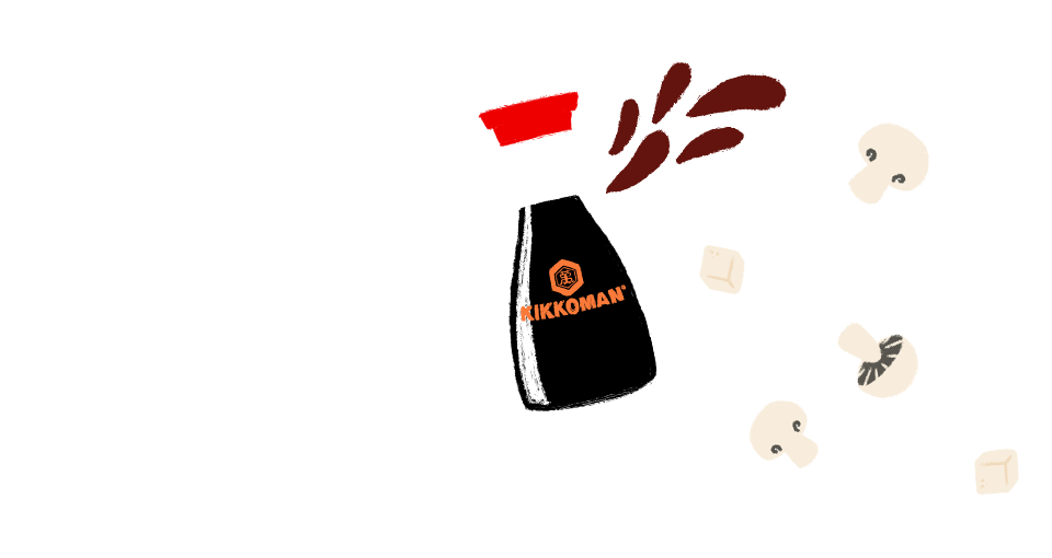
These are also elements that a company strives for which is why the name Kikkoman, and the logo were developed many, many years ago. The characteristic hexagon consists of a symbolic turtle shell and the Japanese kanji character for the number 10,000, uniting “tradition” and “innovation”.

Developed with care

Every Kikkoman bottle features the famous black Kikkoman logo. In 2008 an additional orange-coloured logo was introduced. Orange is a warm colour that reminds us of the sun or flames, and it represents “good health”, “youthful freshness” and “vitality”. The new logo and its colour are special because the colour orange also has appetite-stimulating properties.

The iconic Designer-Bottle, developed by Kenji Ekuan, also helped to make Kikkoman an outstanding and unmistakable brand. This shape is unique and recognizable the world over.

Beautiful and clever: an iconic design classic

Design is a source of life enhancement.
by Kenji Ekuan
That was the motto of the Japanese industrial designer, Kenji Ekuan, who played an important part in shaping Japanese packaging and logo design over the years. One of his most famous designs is the aesthetically pleasing dispenser for Kikkoman Naturally Brewed Soy Sauce dating back to 1961.
1.
Elegance meets practicability

Featuring a curved silhouette and unobtrusive lettering, the bottle’s simplicity, elegance, and modernity make it a genuinely attractive object. This designer bottle beautifies tables in homes and restaurants the whole world over. It has a perfectly shaped pourer for the precise and clean dispensing of small quantities or even single drops of soy sauce without drips. 

As a result, the aesthetically pleasing bottle is both a practical cooking aid and a decorative tabletop condiment. Thanks to its screw-off cap and dishwasher-safe material, the designer bottle can be reused over and over again.

2.
A secret is revealed

Ever wondered why there’s two holes in the cap of the Kikkoman dispenser bottle? It is in fact a clever piece of design which allows you to control how fast the soy sauce is poured out, as demonstrated here by the guys at Bosh.tv who’ve dubbed it the ‘Control Hole’!

3.
The art of enjoyment

Today, the designer bottle is a genuine hallmark of Kikkoman Soy Sauce. It won the Lucky Strike Designer Award in 2003 and, for many years, it has been on display in the Museum of Modern Art in New York and the Design Zentrum Nordrhein-Westfalen in Germany. The cult dispenser isn’t just legendary, it’s also practical.

Discover more

Never miss anything again!

Exciting information, delicious recipes and great competition
Not all required fields have been filled in.

I would like to receive email updates on offers and product information. Unsubscribe any time, free of charge.

Interested in receiving exciting information, delicious recipes and great competitions?

To the newsletter